
About Analytics Dashboard
Administrators can use the Analytics Dashboard to visualize the archived user communication data (emails only) of the top 50 users in the last 30 days. Analytics Dashboard displays this data in the form of charts for better visualization. Administrators can use this data to create searches for retrieving communication and classification information of a user. Based on the selected data, administrators can efficiently obtain more specific, limited, and accurate search results while investigation.
At present, the application provides you with the following charts:
-
User communication chart
-
Classification chart
-
Keyword Cloud
The Analytics Dashboard is shown in the sample image below.
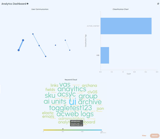
User Communication Chart
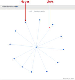
The chart has Nodes and Links connecting these nodes. Nodes in the chart represent users, and links represent the connections between or among these nodes. To select a node, click on the node. To select multiple nodes, press and hold the CTRL key on your keyboard, then click on the nodes you want to select. To enhance readability, you can drag any node away from crowded areas to separate it from neighboring nodes.
Hovering over nodes provides the user email address. Whereas hovering over links displays the user email addresses of individuals in communication.
Classification chart
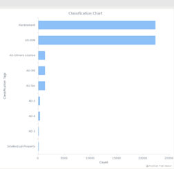
This is a graphical representation of the user communication chart.
The charts are interconnected. Hence, selecting or filtering the data (nodes and links) in the User Communicationchart leads to the automatic selection of corresponding data in theClassification chart and vice versa. You can only select one filter criteria at a time. If you wish to search communication data using a different filter, in such a scenario, click the Back icon, choose the desired link or node, and then click Search. Click the Refresh icon to refresh the monitoring data.
Keyword Cloud
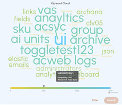
The Keyword Cloud provides deeper communication insights, improving the accuracy and efficiency of investigations through interconnected dashboard views.
It displays the most exchanged keywords between users over the past 30 days to help identify key topics or emerging trends. It shows keyword frequency with trend lines, allows hover for details, and supports multi-select for focused searches across the dashboard.
Related information